
In this post, I’m going to show you how to use Zoho Analytics to combine data from leads, deals, and sales orders so you can see the relative conversion rate.
For example, in this chart we’ve got the leads in yellow, the sales orders in blue, and the deals in green, which gives you a bit of an indication of the conversion rate. I also did a percentage conversion rate here for lead to deal, and I will show you how to do it for lead to sales order.
Before we can get into that, I need to show you how to get the underlying data because it’s not necessarily that simple to get the data into a format to produce the graph above. What you need to do is create a new query table. 
I’ll show you the one that I created here so that you can have a look at the query that I built. 
I have extracted the “Created Time” so that we can compare it over different time periods, and then the owner of the sales order, the deal, and the lead. Then I’ve used some SQL to join the tables together. I’ve done a left join, which means that it is going to include all leads regardless of whether the lead was converted.
The left join will mean that even if there’s no corresponding deal, it’s still going to retrieve the lead owner and the created time, but if there is a deal, it’s going to then match it. The way that it’s going to find the records that exist in both the leads and in the deals table is by having this ON “Leads”.”LEADID” = “Deals”.”LEADID” part here where it checks that the lead ID in leads and the lead ID in deals is identical.
Then we have another left join between sales orders and the previous query, which is going to find the sales orders that have a deal ID that matches the ID of the deal that we already matched.
Altogether, what this will do is show us the leads together with any deals/salesorder that were created by converting the lead. You can see here that there’s several hundred records. 
It will also find instances where there’s no sales order but there is a deal. This helps us then to be able to produce this graph here. 
I did a “New Chart View” and what I’ve chosen for the X-Axis is using the lead owner, and then for the Y-Axis, I’ve got the deal owner, the sales order owner, and the lead owner again. I’ve also added in this aggregate formula called the “Lead to Deal” conversion rate.
To help you understand how to do that, I’m going to add another aggregate formula, which I will title, “Lead to Sales Order Conversion Rate.”
I’ll make the data type a percentage, and then we’ll count the percentage of sales orders, divided by the total number of deals, times 100. Simple as that.

Then we can add that aggregate formula as another part of the Y-Axis, and we’re going to use the “Actual” value rather than the “Count” because it would be something like 5%. 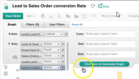
If we look here, for example, where there is a sales order, the lead to sales order conversion rate is 2.56%.
Hopefully that has helped you to understand how you can create quite complex dashboards within Zoho Analytics using some SQL.